
This year saw the 25th anniversary of the publicly available World Wide Web, and a lot has changed in those years. As a sunshiny summer holiday season comes to an end, we thought we’d brighten the mood with a look back on some design features from the early days of the Web which we’re happy are now history:
1. Hit counters
In the days before snazzy web analytics, it was common for ‘Webmasters’ to include a home page ‘hit counter’, in case it was of interest to everyone else who visited their site.

2. Guest books
Instead of submitting star ratings or writing product reviews, users were able to leave their comments in an online ‘Guest book’, in a similar way to a country house or museum (“… I liked the glow worms”).
3. Blinking text
When using bold or italic was not quite eye-catching enough, what better way to attract a user’s attention than text that blinks on and off like a night club Karaoke sign…?
4. Scrolling text (AKA ‘marquees’)
If the above needed an answer, how about text that scrolls interminably across the screen: combine with ‘blink’ for maximum impact.
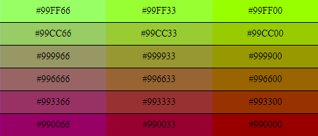
5. ‘Web safe’ colours
Due to the limitations of early displays, sites were restricted to using a palette of 216 ‘Web safe’ colours, resulting in some truly garish designs.
6. Animated GIFs
Before browsers had support for embedded video and multi-media, a two or three frame animated GIF was the go-to way of making pages ‘come to life’. Honourable mention should also go to the ‘interlaced’ GIF, which made pictures look like Lego as they loaded.
7. Under construction signs
Redesigning your site, or not quite finished that important ‘landing page’? Publish it anyway, with a ‘men at work’ / ‘under construction’ sign to reassure visitors that it’s still work in progress.

8. Autoplaying music
In order to create a truly unforgettable user experience, autoplay some jaunty music on a loop which can’t be easily disabled.
9. Splash pages
A firm favourite of old-school marketeers, ‘Splash pages’ containing promotional branding and advertising were often used to ‘introduce’ a site, helpfully delaying users’ access to the actual content itself.
10. “This site works in Internet Explorer only”
The dreaded message for Netscape users at a time when the main challenge for website developers was making a site look the same in “both browsers”.
Thankfully the design features above are now rarely seen in the wild… although we do admit some nostalgia for the days when almost anyone could create a website using DreamWeaver, upload it to GeoCities, and not have it look too out of place in a Yahoo!, Lycos or AltaVista search listing.
