
MasterVision provides publishers with complete customer insight via a fast and user-friendly hosted service. It painlessly merges all of the valuable data from different source systems into an interactive single customer view. As one example, let’s look at some useful ways to analyze article submissions data.
Understanding how submitted articles translate into published articles across different products and subject areas is fundamental to increasing authorship and supporting content development. MasterVision makes it easy to visualize this information clearly and succinctly.
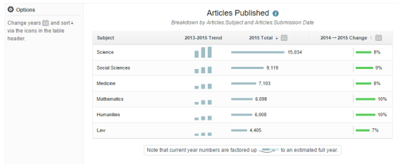
For example, let’s look at a group of journals within the subject area of social science. We can chart how the trend in published articles within that subject area has changed over time, as compared to other subjects. From the table below we can see that published articles for social science journals show a rising trend over the last 3 years, with 9% growth between 2014 and 2015.
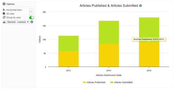
While it’s useful to view published articles in their own right, there’s further value in being able to see how this stacks up against the level of article submissions too.
The analytics tools within MasterVision make it simple to create this sort of comparison, combining articles submitted and published into the same chart. This clearly shows a rising 3 year trend for both submissions and published articles. This view also makes it easy to see published articles as a percentage of submitted articles for each year.
MasterVision makes this type of analysis clear and simple, so that users can stop spending time doing battle with the underlying source data, and start putting data to good use for new publishing strategies.
