
As part of our ongoing quest to make MasterVision even easier to use, we’ve been taking a look at how multi-pick lists on our search forms could be made more user-friendly.
Up until now, we’ve been using the default multi-pick widgets that come as standard in your browser. Typically, these will look something like this:
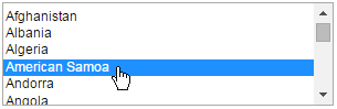
These appear straightforward enough, but there is a problem – in order to make more than one selection, users need to hold down CTRL (if using Windows) whilst clicking. Combined with scrolling through the options, this can be quite fiddly, and it’s all too easy to mistime a click and deselect everything by accident. Plus, with a long list of options in play, it can be tricky to keep track of what’s been selected at any given time.
With this in mind, we did some online research, and found some neat alternatives which could be used as ‘drop in’ replacements. The first we liked used options with checkboxes that could be selected/deselected with a single click:
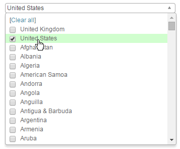
Handily, this also lists the first few selections in the viewport when minimised for an ‘at a glance’ view of the active options:

A second approach we liked was to use two side-by-side lists, allowing users to move choices from left to right between them. This works especially well with a larger number of selections, which are always shown in full on the right hand side:
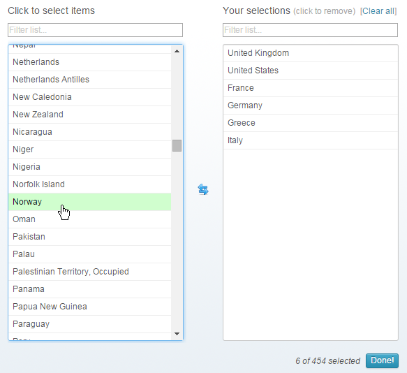
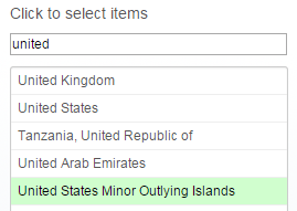
With this approach, there is also space for a handy search/filter tool above each list, allowing users to narrow down a large number of options quickly and easily:
Since both of these approaches have their merits, that then left us with a tricky choice of our own – which should we use? In the end, we went for both: the first as an ‘in page’ replacement for the browser’s default multi-pick widgets, and the second as a ‘popup’ tool which could be used in addition when needed.
We think this will give MasterVision’s users all the help that they need when making search selections from multi-pick fields, and are looking forward to receiving feedback on this new feature.
