If you saw our blog article ‘Who ate all the pies?‘ a couple of months ago, you’ll know that we’re always on the lookout for new ways to make using MasterVision as clear and intuitive as possible for our clients.
Our latest quest, following the KISS principle (‘Keep it simple, stupid’), has been to simplify the search forms. This doesn’t mean removing information – far from it – but it does mean that what you do see is as clear and concise as possible. The changes we’ve made bring other benefits, too:
- Some search fields aren’t relevant until a specific choice has been made; these can now be revealed only when needed.
- Similarly, fields that shouldn’t be combined with those currently selected can be hidden when a particular selection is made.
- Multiple alternative search fields, where only one is required, can be grouped into a single dropdown.
Less is more
So what does this mean in practice? Essentially, there’s less to see, unless you choose to see more. By making selections, further relevant search options are revealed.
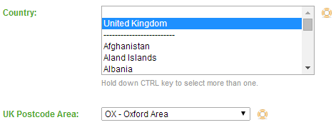
A simple illustration of this is shown below – when ‘United Kingdom’ is selected from the ‘Country’ field, the search field for ‘UK Postcode Area’ appears:
To ensure two potentially conflicting search fields aren’t inadvertently populated, they can be grouped so that only one may be completed in a search. One example of this might be where there is an option to search for USD or GBP subscription values (not both!):
A combination of these enhancements can be applied to a number of related fields, ensuring not only that the form is less cluttered with unnecessary information, but also that conflicting choices are avoided, giving you valid searches, and ultimately more meaningful results.
To quote Leonardo da Vinci: “Simplicity is the ultimate sophistication”. We hope you agree.


