
Dashboards are not only a great way to create customized visual reporting for key measures in your customer data – they can also be a thing of beauty.
We’ve been busy developing new dashboard functionality for our core product, MasterVision, which complements our analytics tools with clear and beautiful visuals.
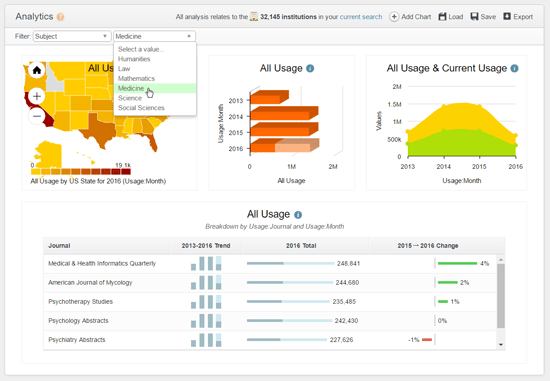
Clear and illuminating
Dashboards should be comprehensive, but not overwhelming; attractive but not distracting. Users should be able to immediately understand what they are looking at – they may have a limited understanding of the complexity of the underlying data, so what they see must be clear.
MasterVision dashboards nicely represent the results of often complex analysis, and provide a quick way to navigate to key measures such as revenue, usage, denials, papers submitted / published, or articles purchased. And for each current year-in-progress, MasterVision can intelligently forecast likely full-year counts based on previous patterns.

Flexible
The dashboard should be a flexible environment. While you may want to be able to download snapshots to keep for later reference, you will usually want the numbers behind them to update as the data changes, so that you’re not left with out-of-date visuals. Each time MasterVision is refreshed with the latest customer data, charts are automatically updated without the need to re-run your analysis.
Charts, tables and maps can all be dropped into a dashboard, so you can easily add in new visuals and re-size them according to your needs as your exploration of the data progresses.
Not the end of the story
Charts and dashboards needn’t be the end of your analysis work, either – they can often be a useful starting point. MasterVision enables you to drill down further (e.g. from annual to monthly) and to click through to view the full list of customers behind each data point.

Re-purposing
We understand that the needs of sales staff are different to those of an editorial team, for example. The ability to manipulate the underlying nature of all charts within the whole dashboard at the touch of a button is therefore extremely useful: for example to switch the focus of an entire dashboard to show data for a specific subject, product or country.
We’re very excited about this important new enhancement, which makes creating beautiful and informative visuals extremely simple and user-friendly.
