
Hot on the heels of last month’s announcement of PaperStack’s new filtering feature, this month we have another exciting enhancement to introduce: a brand new set of colour palettes that you can pick from to customise your PaperStack experience.
A simple drop-down menu offers a choice of colour palettes:

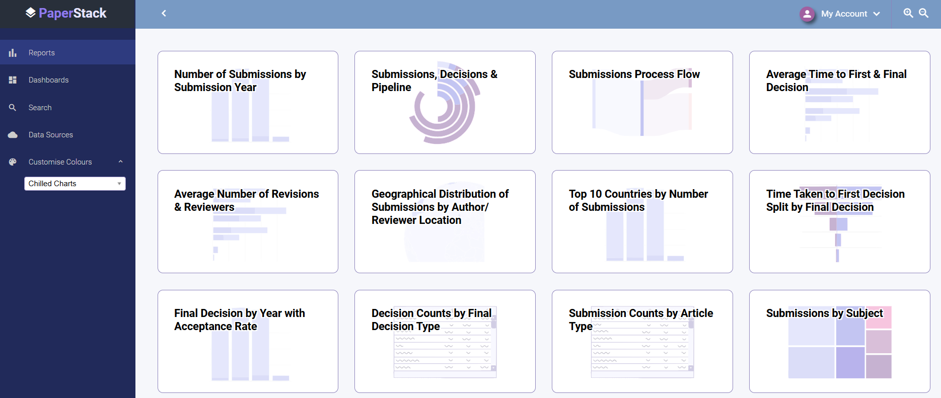
Each palette comprises a set of colours carefully selected to work well together, enabling you to change the appearance of the whole product, from navigation to charts, in a single click:
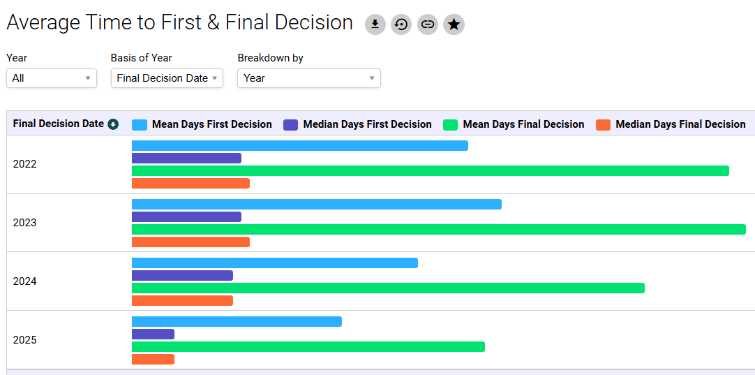
A particular colour palette may work best for you for practical reasons – ‘High Contrast’ has accessibility benefits, particularly when viewing a chart containing a lot of information:
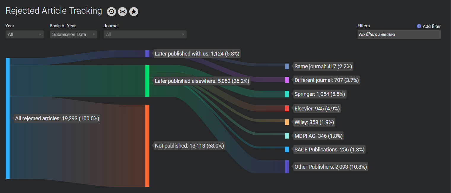
Or a colour scheme such as ‘Ultraviolet’ may appeal to you for more aesthetic reasons:

Whatever palette you choose will be remembered each time you log in, and these settings are device-specific, so you can personalise your PC and mobile device in different ways, with the colours that work best on each type of screen. But because they’re so quick to change, it’s also easy to do this as one-off to suit a specific environment – for example, you may find ‘Perfect Dark’ works best in low light:
Your chosen colour scheme will be applied across the board, up to and including PDF downloads of individual charts. So if you’re putting these charts into a report to present to senior management, you can choose the palette that best fits your company branding.
To see this new feature in action, please get in touch to book a demo.
